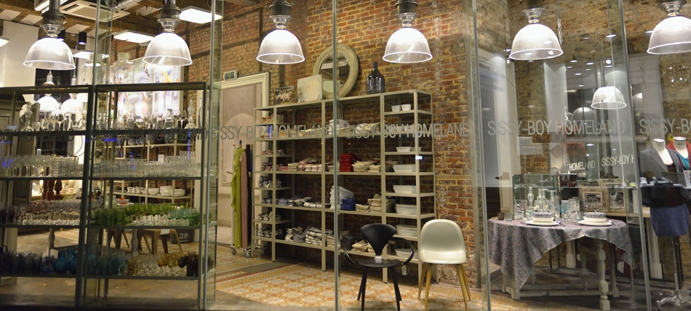
Retail store design is ultimately an extension of the retail brand itself. It needs to be an extension of your marketing and focus on your target customer. While we all want to be able to use the most premium, stunning and high-end finishes, this is not always realistic.
Costs associated with fitting out a retail store are steep at the best of times, but combine this with high rental costs and bricks and mortar stores can become an expensive exercise. Plus, any money that is invested in the fitout obviously needs to be recovered in sales.
So, how can retailers create a fitout that has the right finishes and brand appeal to suit their target market while at the same time being savvy with their costs? It is possible—it’s all about being clever with the design, understanding where it is worth investing funds and where it is best to be thrifty. It is also about having a thorough knowledge of the materials available and understanding durability versus cost.
Here are some ways to get clever with your retail fitout design:
1. Custom versus off the shelf options—this is one great way to save costs. It may be worth investing in a few custom pieces throughout your store, but avoid customising elements that may not be as noticeable. Items that are worth looking at purchasing off the shelf may include clothing racking or shelving. You can put highlight feature pieces, or custom pieces, between your generic racking and in the entry to your store to create a more personal and customised experience.
2. Order in multiples—when manufacturing, it will always be a cost saving if you are making a larger purchase. Consider buying for multiple stores that you may open down the track, rather than one store at a time, if this is a feasible option for your business.
3. Utilise strong graphics—I would recommend hiring a graphic designer as great graphics can create a huge impact in your retail store. Graphics can not only be used in your marketing, but also on your walls! Consider creating a huge mural or custom wallpaper. However, ensure the graphics selected will allow for longevity and won’t look tired after a short amount of time.
4. Retain and work with existing finishes within the site—look at the floors, ceiling treatment, lighting, shopfront, walls and back of house. Can you work with what is currently there, with a refresh rather than a demo and rebuild? If the item is in good condition, it is a guaranteed way to save costs if you can refresh it with paint, wallpaper, a sand and recoat, or application of new finishes. You should take all of this into account when reviewing a site for lease. The more you can re-use, the more you will be able to save on your fitout.
5. Retain your shopfront—replacing glazing and entry points can be quite a costly exercise, so where possible retain your existing point of entry, and instead look at retreating your shopfront finishes and graphics.
6. Get multiple quotes—this is standard practice for retail design, but it’s an important process no matter how trusted your trades are. Generally, aim to get quotes from three different builders/shopfitters. That will allow you to compare all prices and ensure you are getting the best deal.
7. Research finishes options—there are many alternate options out there that can produce a very similar result, for example timber floorboards versus vinyl, timber treatments versus veneer or laminate or leather versus vinyl. The key is to do your research, speak to suppliers and compare costs, or invest in a designer that can assist you.
There are many ways that strong and bold retail solutions can be produced to great effect and on a budget. Be clever with where you invest your funds; invest in items that can be re-used and that won’t date, or key pieces that will add to the overall ambience and experience. And always design with your target customer in mind.
Amy Gray has been a retail store designer for over 10 years. She now runs Studio Grayscale, producing innovative and creative design solutions for commercial interior spaces.

